
The layout of your website is one of the first things visitors notice—even if they cannot name it. A clear structure helps people find information quickly. A confusing one creates friction and makes your business feel harder to work with.
Choosing the right website layout design is less about following trends and more about matching the structure to your goals, audience, and content. A service business, an online store, and a content-heavy site usually need different approaches.
Here’s a practical look at the most common layout types, the factors that should guide your decision, and how to select a structure that actually works for your business.
Why Website Layout Matters
Layout controls how information is organized and how easily visitors can move through your site. A strong layout makes key messages easy to find, guides people toward the next step, supports mobile usability, and helps the site feel organized and professional.
Poor layout choices often lead to high bounce rates, missed calls-to-action, and the impression that the business is disorganized—even when the service itself is excellent.
Common Website Layout Types
Understanding the main options makes it easier to choose.
Full-Width Hero + Content Sections
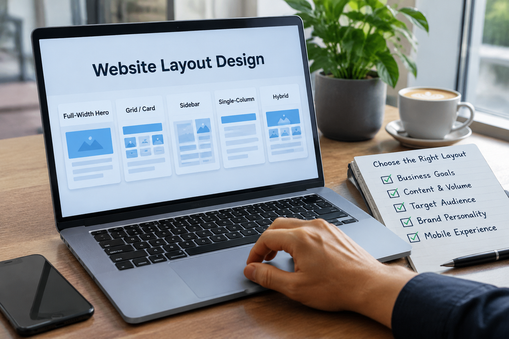
A large banner or hero area at the top followed by stacked content sections. This is one of the most popular layouts for service businesses and local companies. It works well when you want a strong first impression and a clear story flow from top to bottom.
Card or Grid Layout
Content organized into cards or a grid—services, products, projects, or blog posts. This layout is highly scannable and works especially well for portfolios, product catalogs, and service overviews.
Sidebar Layout
A main content area with a sidebar for navigation, contact details, or secondary information. Still useful for blogs, resource pages, and some professional service sites, though pure sidebar designs are less dominant on mobile.
Single-Column Layout
Everything stacked in one vertical column. Simple, mobile-friendly, and effective for landing pages, simple service sites, or businesses with limited content.
F-Pattern and Z-Pattern Influenced Layouts
These are not rigid templates but reading patterns. The F-pattern is common on text-heavy pages. The Z-pattern works well on simpler pages with a clear path from headline to call-to-action. Good designers use these patterns to place important elements where eyes naturally travel.
Hybrid Layouts
Most modern business websites combine elements. A full-width hero, followed by a card grid of services, then a testimonial section, and a final call-to-action is a common and effective approach.
Key Factors That Should Guide Your Choice
Business goals matter first. If you need leads, prioritize clear calls-to-action and simple navigation. If you sell products, product grids and easy filtering become more important. If you want to build authority, content structure and readability take priority.
Type and volume of content also shape the decision. A five-page service site needs a different structure than a site with dozens of products or a large blog. Too many layout variations across pages can feel inconsistent. Too little structure on a content-rich site makes information hard to find.
Your audience influences the layout as well. Local service customers often want phone numbers and clear service lists quickly. B2B buyers may spend more time reading detailed pages. Mobile-heavy audiences need layouts that remain clean on small screens.
Brand personality plays a role too. A clean, minimal layout suits professional services and consultants. A more visual, image-driven layout may fit creative or lifestyle brands. The structure should feel consistent with how you want the business to be perceived.
Finally, mobile experience cannot be an afterthought. Every layout must work well on phones. What looks balanced on a large screen can become cramped or confusing on mobile if not planned carefully.
Practical Steps to Choose the Right Layout
Start with your primary pages. Map the homepage, main service or product pages, and the contact page first. These pages usually determine the overall structure.
List the essential content blocks—hero message, services or products, proof (testimonials or results), about or process, and a clear call-to-action. Arrange them in a logical order before focusing on visual style.
Prioritize clarity over complexity. A simple, well-organized layout almost always outperforms a complicated one that looks impressive but confuses visitors.
Test the flow on mobile. Open early designs on a phone and ask: Can someone understand what you do and how to contact you within a few seconds?
Keep consistency across the site. Navigation, spacing, section styles, and button treatment should feel familiar from page to page.
Consider future growth. Choose a structure that can accommodate new services, blog posts, or product categories without requiring a full redesign later.
Common Mistakes to Avoid
Crowding the homepage with every possible message is a frequent problem. Using a complex multi-column layout that collapses poorly on mobile creates frustration. Hiding contact information or primary calls-to-action reduces conversions. Changing the basic structure dramatically from page to page makes the site feel disjointed. Choosing a layout because it looks modern rather than because it serves the content and goals rarely works well long-term.
Matching Layout to Business Type
Local service businesses often do well with a full-width hero, clear service sections, and a strong call-to-action. Professional services usually benefit from a clean single or hybrid layout that focuses on trust and clarity. Product-based businesses tend to need grid or card layouts with strong filtering. Portfolios and creative businesses often use visual grids or project showcases. Content-focused sites usually work best with readable single-column or light sidebar structures.
These are starting points, not rigid rules. The best layout still depends on your specific content and goals.
Final Thoughts
The right website layout design supports how people actually use your site. It makes the most important information easy to find, guides visitors toward action, and works reliably on every device.
You do not need the most complex or trendy structure. You need a clear, consistent layout that matches your business goals and makes it simple for visitors to understand what you offer and how to take the next step.
Looking to create a clear, professional website structure for your business? Nexryvo helps businesses design and develop modern, responsive WordPress websites with thoughtful layout and strong usability. Get in touch with our team to discuss your project.